Chart Formatting
Introduction:
As we learned previously charts are used in Excel to display data visually, and that through basic formatting you can edit the look and feel of charts through using Chart Styles. There is also the ability to add elements to a chart and to edit the chart axes to better represent your data as it appears on the chart making it easier for viewers to ascertain specific details about the values represented by columns and pie pieces.
Learning:
Chart Formatting
The chart formatting of the axes, adding labels, and text boxes to charts can improve the viewers ability to absorb information quickly and improve comprehension also. Adding these elements or editing them are easy ways to make charts more professional looking.
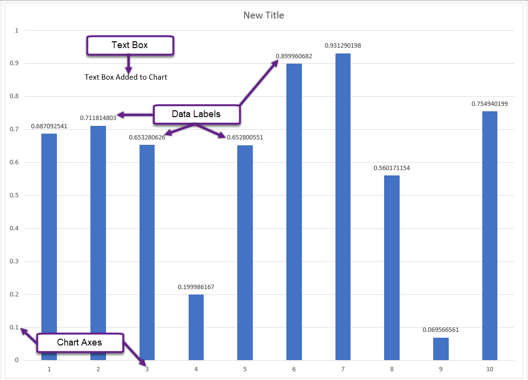
Chart Axes
Charts define data on along the horizontal and vertical axes, providing detailed information to the viewer on the data represented in the chart. Pie charts do not have axes, but column charts do. To modify a chart axis, right click the axis and choose Format Axis from the menu. This will open the Format Axis task pane on the right side of the Excel window. You can adjust axis values using these menu options.
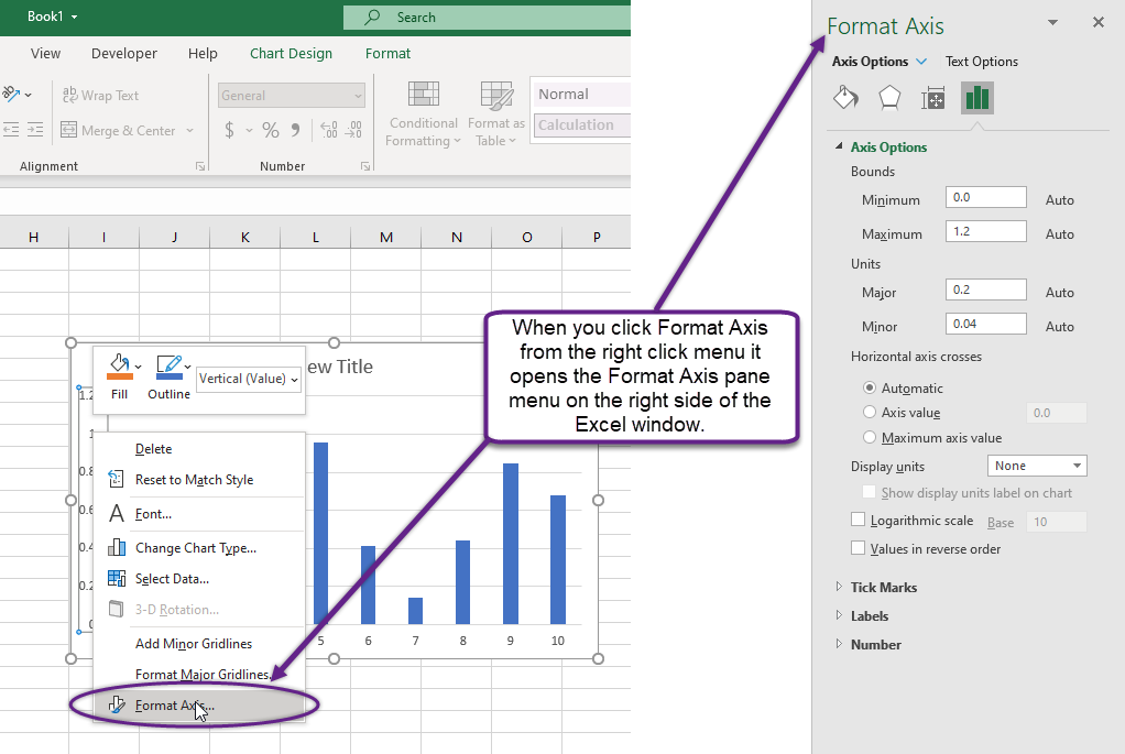
Chart Data Labels
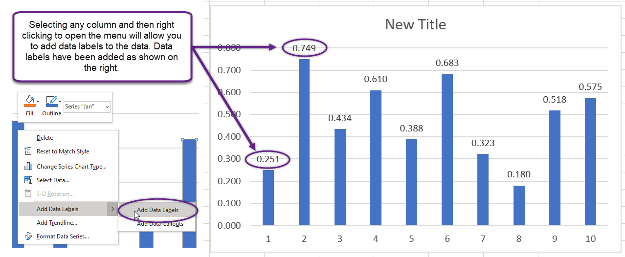
There are times where you want your chart to display the percentage or numerical value on a column or pie piece. To add data labels to a chart you can either right click on a column or pie piece and select Add Data Labels from the menu options
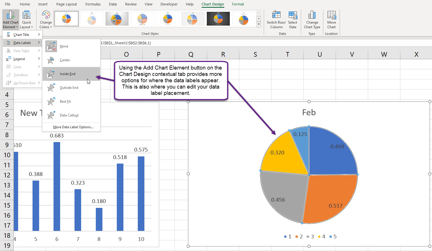
or you can select a column or pie piece and use the Add Chart Element button in the Chart Callouts group of the Chart Design contextual tab on the Ribbon to add them. The latter option provides more control about where the data labels appear on the column or pie chart.
Text Boxes
Excel also provide the ability to add text to a chart using text boxes. To add a text box, activate the chart and on the Insert tab of the Ribbon in the Text group, click the Text Box button.

Then click in the chart to drag and draw a text box. After entering the text, you can move the text box and format the text to make it stand out.

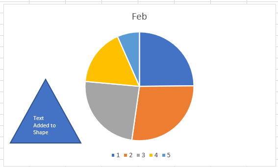
You can also add text by adding a shape to a chart and placing text in a shape.
Summary:
Excel charts as a visual representation of data are only as good as their formatting, and taking simple steps to add additional text, data labels, and editing chart axes makes the comprehension of the chart easier for viewers.
Sources:
IDM