Chart Basics
Introduction:
Excel is not just used for organizing and processing data and formulas. It also can be used to visually represent data in the form of charts and graphs. Data in worksheets can be visually represented using charts in Excel. The rows and columns of data can be visually displayed in a chart as a bar on a column chart or pieces of a pie in a pie chart. The use of charts allows the viewer the more easily identify trends and outcomes of data.
Learning:
In Excel, charts are a primary way to convey the visualization of numerical data. If you’ve heard the adage “A picture is worth a thousand words” then you know it also holds true for pictures to interpret numbers. Charts make sales trends, marketing numbers and comparisons of all sorts of numerical data come to life.
Excel contains multiple types of charts to choose to make the data speak. Follow these steps to add a chart to a worksheet.
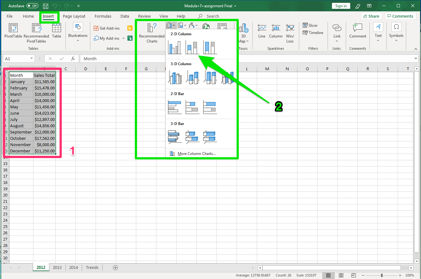
- Open a worksheet with the numbers already entered or enter the data to be used in the chart. Make sure to organize the data into the order in which you wish it to be displayed in a chart. Select all the data making sure to include the headers and labels for the data. This should be at least two columns of data.
- Select the Insert tab and find the Charts Group on the ribbon. Select the style of chart to use for that data. For this example, it is a Bar chart style, in the 2-D Column, Cluster column chart. If you are uncertain of what type of chart to use, select the Recommend Charts button and a dialog box with a few options will open.
The chart opens with the data information in it and can be moved, edited and resized like a graphic. Notice that when the chart is selected, the data associated with it is highlighted in different colors
There are two main ways to edit a chart
- To the upper right of the chart area are three buttons that can be used to change Chart Elements, modify the style or color, and edit the valued or names.
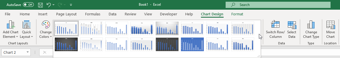
- Modifying the chart style, color and design can also be accomplished by rolling the cursor over the options in the ribbon and selecting the style desired.
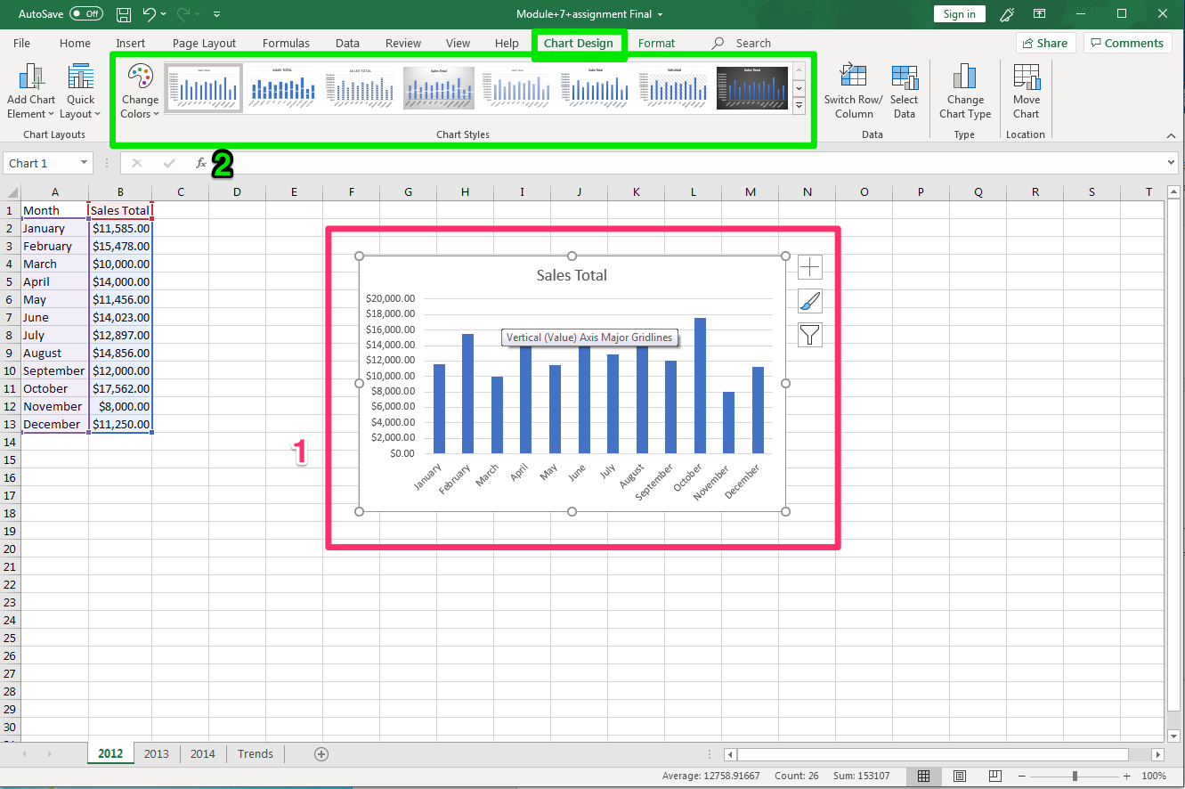
Chart Types
Although Excel has many charts in this course we are going to focus on the Column and Pie charts. However, it is important that you match your data to the correct type of chart to make sure that it is represented correctly. Luckily, Excel offers a Recommended Charts button, in the Charts group on the Insert tab of the Ribbon, which will help you determine which chart is best used to represent your data.
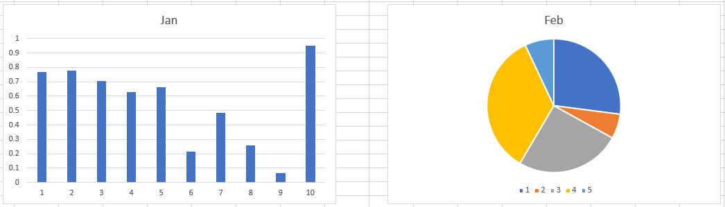
Pie Chart
The pie chart displays data as pieces of a pie, where the slice sizes are representative of the proportion of each data to the whole. Pie charts are best used with smaller data sets (five or less) otherwise the slices and data may be difficult to perceive.
Column Chart
The column chart displays data in vertical columns, where the height of the column represents the value of the data that was selected in creating the chart. These charts are used to compare results between different data of common origin.
Chart Formatting
Excel will enter default names for Chart Title, but these are easily changed at any time. For all graphs, care must be taken to properly identify titles and labels to ensure understanding.
Chart Title
When a chart is created Excel often uses a cell reference to create a title for a chart. The title can easily be changed to better represent your data or the desired name for the chart. To change the chart title, select the chart title to activate it (bubbles appear on corners) and either select the text in the chart title and replace it or type the new title in the formula bar. Use the font formatting tools on the Home tab to format the font size, color, etc.
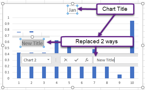
Chart Style
After creating a chart, Excel provides the ability to change the format and style of the chart using the Chart Styles menu on the Chart Design contextual tab of the Ribbon. These built-in formats provide different and unique ways of formatting a chart easily to represent your data more effectively. Hovering over an option in the drop-down menu will display how your chart will look if selected.
Moving Charts
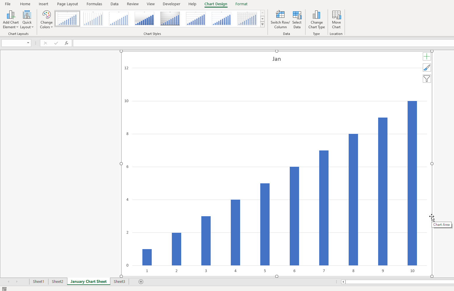
There are two types of charts in Excel, embedded charts which reside on a worksheet that contains data (this is the default placement of charts when created) and chart sheets where the chart is displayed on its own worksheet tab. An embedded chart works well if you want to display a chart alongside your data, whereas a chart on its own sheet works best if you have larger data sets or your chart is intricate. Either way an embedded or chart on a chart sheet are both linked to the data that they were constructed from.
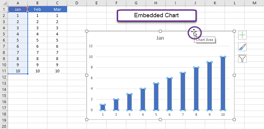
To move an embedded chart, simply activate the chart by selecting it and then when the cursor turns to a four-way black arrow drag and drop the chart on the worksheet where you would like it to reside. A neat trick is to hold the ALT key down and the chart will ‘snap’ to the nearest gridline making it easier to align.
To move an embedded chart to a chart sheet, click on the chart to activate it and on the Chart Design contextual tab of the Ribbon click the Move Chart button in the Location group.
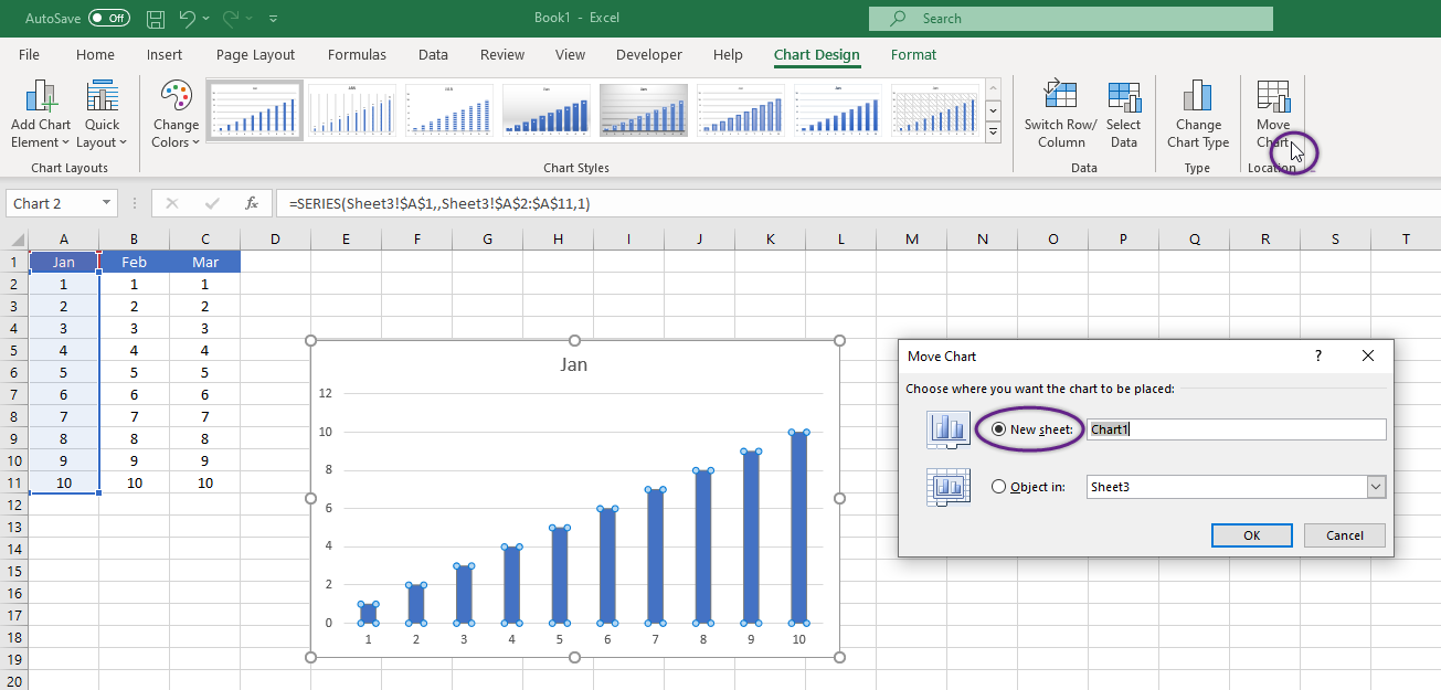
Click on New Sheet and provide a name for the chart before clicking OK. You can also right click on an embedded chart to perform the same task and choose Move Chart from the menu options.
Summary:
There are many types and styles of charts and graphs from which to choose. The same process of adding a chart as it was done above is used to insert other types of charts. Here are three other examples of types of charts based on the same data as the first chart. See which one seems to represent the data the clearest.
Using column and pie charts to represent data in worksheets provides the viewer with an easier means of comprehending trends and outcomes of data analysis. Moving a chart, changing the chart title, and chart style improves the charts appearance and again improves the viewers ability to comprehend the data contained in the chart.
Sources:
IDM