Pie Charts
Introduction:
Excel is not just used for organizing and processing data and formulas. It also can be used to visually represent data in the form of charts and graphs. A pie chart is used to show a percent of total for a data set at a specific point in time. A pie chart is a circle with wedges cut of varying sizes marked out like slices of pie or pizza. The relative sizes of the wedges correspond to the relative frequencies of the categories.
Learning:
Similar to the column chart, the key to creating an effective pie chart is the number of categories presented on the chart. Although there are no specific limits for the number of categories you can use on a pie chart, a good rule of thumb is ten or less. As the number of categories exceeds ten, it becomes more difficult to identify key categories that make up the majority of the total. A pie chart is a type of chart with the shape of a pie or circle. It presents the relationship of different parts of the data. One would easily see the biggest or smallest share of the total data, by simply looking at the pie chart.
Pie charts are not the most accurate way to show data, most statisticians consider that the pie chart is one of the worst ways to display information. The human eye is bad at comparing relative areas, but good at judging linear measures. What all can agree on is elliptical, exploded, 3-dimensional or otherwise non-circular pie graphs are most certainly misleading, and should not be used. Don’t get fancy with graphs! People sometimes add features to graphs that don’t help to convey their information. For example, 3-dimensional charts are usually not as effective as their two-dimensional counterparts.
Even with its limitations, the pie chart still it used in many instances. If percentage of a total is of value, a pie chart is an appropriate choice. It is worth noting, a pie chart is most suited when displaying a single series of data (a single column or single row). Excel makes generating a pie chart from data very simple, and allows customization of the chart to enhance readability. Pie charts can often benefit from including frequencies or relative frequencies (percents) in the chart next to the pie slices. Often having the category names next to the pie slices also makes the chart clearer. Adding this information is easily accomplished in Excel without having to perform additional calculations.
Adding a Pie Chart
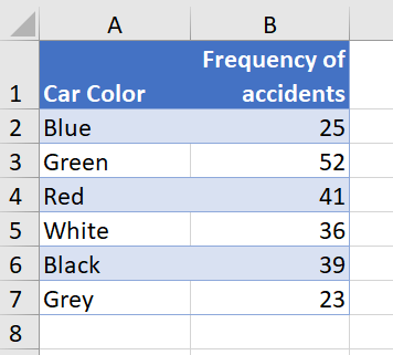
Let’s use an example and explore why the pie chart may be an excellent choice to visualize the data. An insurance company determines vehicle insurance premiums based on known risk factors. If a person is considered a higher risk, their premiums will be higher. One potential factor is the color of your car. The insurance company believes that people with some color cars are more likely to get in accidents. To research this, they examine police reports for recent total-loss collisions. The data is summarized in the frequency table below.
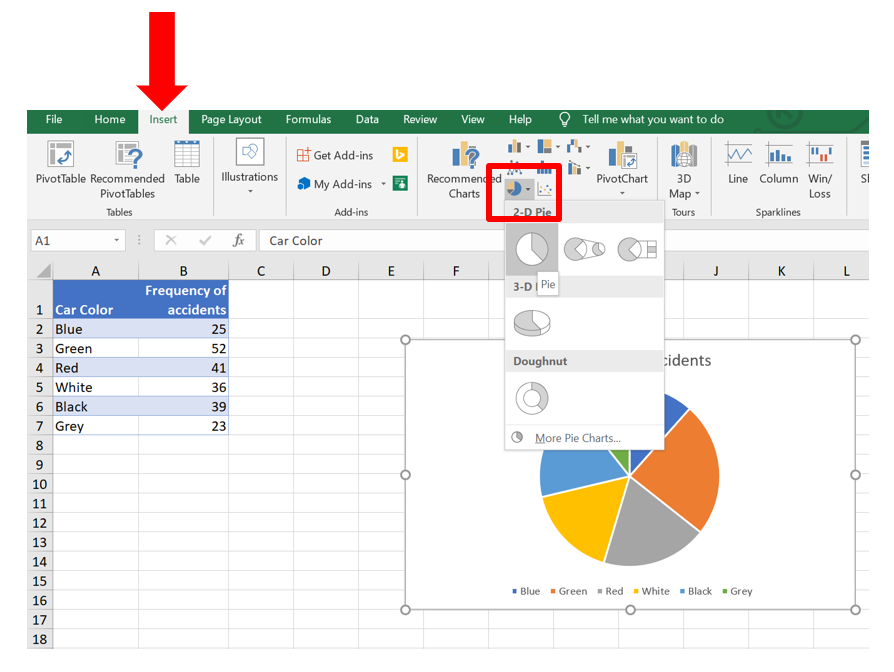
The first step is to select the data you want to graph. Select cells A1:B7. Then select the Insert tab, and choose a 2-D pie chart from the Charts group.
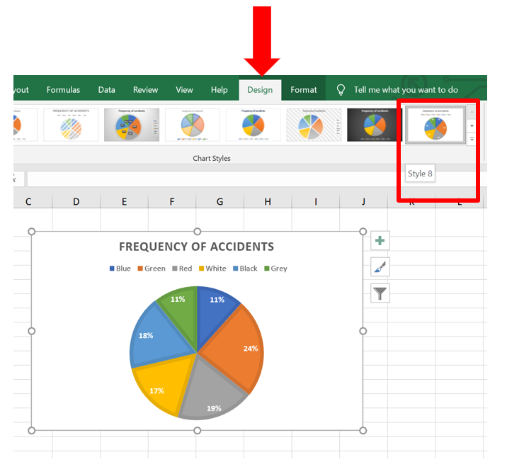
Once the chart is generated, you can adjust the format of the chart to more appropriately display the information. Select the chart, and the contextual tab, Chart Design will become visible. Select the Design tab, and adjust the format using the chart style. In the below picture, the chart Style 8 has been selected. Notice that the legend is now on the top of the chart, and the percentages of each color is displayed within the chart, even though no percentage calculations were actually computed on the spreadsheet.
Can you think of other enhancements? How about changing the pie colors to match the Car color? The process to do this is also rather simple, and useful to know. Select the orange wedge in the pie chart. This wedge represents the Green cars (isn’t that confusing?) Be sure that you only have the orange wedge selected (look for the dots at the corners of the orange wedge only).
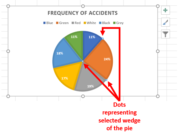
Once you have the wedge selected, right click to access the menu options to adjust the format. Use the Fill command to change the wedge color to Green.
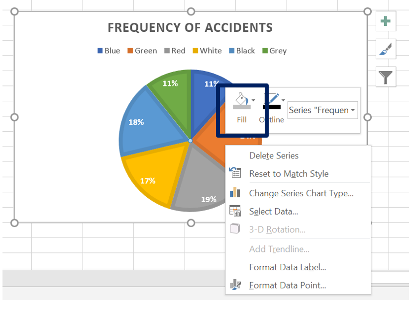
Repeat this for each of the remaining wedges. The final chart looks like this.
Summary:
A pie chart is a circle with wedges cut of varying sizes marked out like slices of pie or pizza. The relative sizes of the wedges correspond to the relative frequencies of the categories. The process to insert a pie chart is to select the data that is intended to be graphed, click on the Insert Tab, and select the 2-D pie chart from the Charts group.
Sources:
InfluentialPoints.com (n.d.) Basic Statistics: Pie Charts. Retrieved from https://influentialpoints.com/Training/basic_statistics_piechart.htm Licensed under: CC BY 3.0
Lippman, D. (2012) Math in Society. Retrieved from http://www.opentextbookstore.com/mathinsociety/ Licensed under: CC BY-SA 3.0