Absolute Cell References
Introduction:
There may be times when you do not want a cell reference to change when filling cells. Unlike relative references, absolute references do not change when copied or filled. You can use an absolute reference to keep a row and/or column constant.
Learning:
By now you should be very familiar with cell referencing. The cell referencing is by default set to relative referencing. What this means is the when a formula or function is copied, and relative cell references will automatically update with the associated column or row address relative to the new cell location. This was very helpful to create spreadsheets very quickly.
However, there are times when you do NOT want a certain part of your cell reference to change when you copy the formula to a new cell. You need to “lock” the cell address as an absolute cell reference. The way to “lock” the cell is to put a $ in front of the row and/or column part of the reference. If the dollar sign ($) precedes the column or row (but not both), it’s known as a mixed reference.
Absolute Referencing interrupts the relative referencing so that only chosen cell references can be used.
Using the dollar sign ($) makes a reference absolute.
Examples of absolute references.
|
Cell reference |
is Called |
Means |
|
A1 |
Relative cell reference |
The column and the row will change accordingly when copied. |
|
$A$1 |
Absolute cell reference |
The column and the row do NOT change when copied |
|
A$1 |
Mixed reference |
The row does NOT change when copied |
|
$A1 |
Mixed reference |
The column does NOT change when copied |
To quickly add the dollar symbols use the F4 key, which toggles four ways. First press gives both row and column absolute, $A$1, second press gives row absolute, A$1, third press gives column absolute, $A1 and finally fourth press returns to fully relative, A1.
An example to see how Absolute Referencing works
Suppose you have the following spreadsheet for XYZ corporation. You want to calculate a new price based on a projected percent increase for several product prices. You set up the spreadsheet to allow different scenario’s to calculate the new prices.
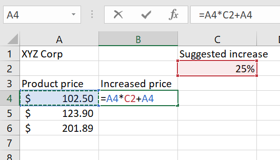
The formula will calculate the new price based on the original price multiplied by the increased and then add to the original price. The formula is =A4*C2+A4. Why put in the cell reference A4 two times? This is because you are taking the A4 reference and multiplying it by 25% (which is in cell C2). Then you are adding the original amount back in to get the whole increase amount. You hit enter and get the new price for the first product. Knowing you can copy this formula to the remaining two cells in the column, you do this and get the following result.
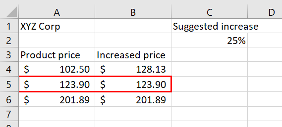
Does the output of your formula make sense? Notice that rows 5 and 6 didn’t seem to change.
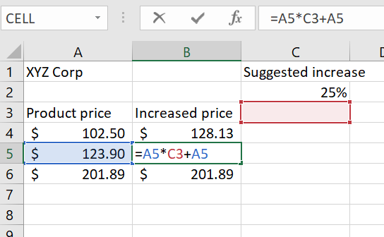
It is important to note that the accuracy of the output produced by a formula depends on how it is constructed. Therefore, always check the result of your formula to see whether it makes sense with data in your worksheet. How would you determine what went wrong?
Explore the underlying formula’s in more detail. Double-click in cell B5 to see the actual formula. The formula is in relative cell referencing, there are no $’s in any of the cell addresses. But should there be? Yes, you want each new row to always multiply by the percentage increase in cell C2.
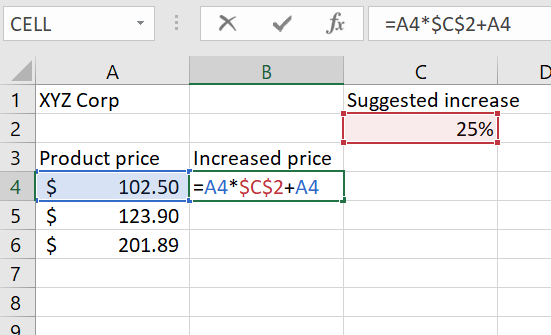
Let’s fix the original formula to be always reference cell C2 by adding the $ to the cell reference. The correct formula will be =A4*$C$2+A4
And copy this corrected formula to the remaining cells B5 and B6. This is the result
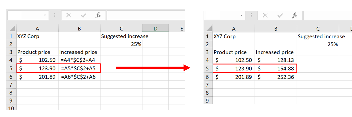
The dollar signs in $C$2 which make this reference absolute. The easiest method to add the $ to the cell reference is to use the F4 key on your keyboard (at the very, very top of the keyboard.) When F4 is pressed, dollar signs should appear before the column reference and before the row reference – in this case $C$2. (If the F4 key doesn’t appear to work, make sure that the referenced cell (C2) is highlighted. Or you can type the dollar signs by hand.)
When you copied the formula in B4 down to include B6. Look at the formulas carefully. Notice that the product price reference (A4) changed because it is relative (or references the next cell). However, the absolute reference (C2) did not change.
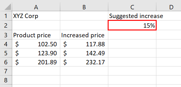
Great! Now that the spreadsheet is correct, you present it to your team, and your supervisor wants to see what will happen if the increase was 15% instead of 25%. Because you set up your spreadsheet to use the Absolute referencing for the percentage, you only need to change that 1 value, and the price increase amounts change automatically without pulling down the formula or putting in a different formula.
Summary:
To prevent Excel from changing the cell references in a formula or function when they are pasted to a new cell location, you must use an absolute reference. You can do this by placing a dollar sign ($) in front of the column letter and row number of a cell reference or by using the F4 function key.
Sources:
Microsoft Office/Working with Formulas. Retrieved from https://en.wikibooks.org/wiki/Microsoft_Office/Working_with_Formulas. Text is available under CC BY-SA 3.0
Relative and Absolute Referencing. Authored by: Fran Wells. License: CC BY 4.0