Chapter 3
Section 3.3 – Excel Charts
Learning Objectives
- Learn how to use a column chart to show a frequency distribution.
- Learn how to use a pie chart to show the percent of total for a data set.
- Create a separate chart sheet for a chart embedded in a worksheet.
This section reviews two of the most commonly used Excel chart types. To demonstrate the variety of chart types available in Excel, it is necessary to use a variety of data sets. This is necessary not only to demonstrate the construction of charts but also to explain how to choose the right type of chart given your data and the idea you intend to communicate.
Choosing a Chart Type
Before we begin, let’s review a few key points you need to consider before creating any chart in Excel.
The first is identifying your idea or message. It is important to keep in mind that the primary purpose of a chart is to present quantitative information to an audience. Therefore, you must first decide what message or idea you wish to present. This is critical in helping you select specific data from a worksheet that will be used in a chart. Throughout this chapter, we will reinforce the intended message first before creating each chart.
The second key point is selecting the right chart type. The chart type you select will depend on the data you have and the message you intend to communicate.
The third key point is identifying the values that should appear on the X and Y axes. One of the ways to identify which values belong on the X and Y axes is to sketch the chart on paper first. If you can visualize what your chart is supposed to look like, you will have an easier time selecting information correctly and using Excel to construct an effective chart that accurately communicates your message. Table 3.2 “Key Steps Before Constructing an Excel Chart” provides a brief summary of these points.
Integrity Check
Carefully Select Data When Creating a Chart
Just because you have data in a worksheet does not mean it must all be placed onto a chart. When creating a chart, it is common for only specific data points to be used. To determine what data should be used when creating a chart, you must first identify the message or idea that you want to communicate to an audience.
Table 3.2 – Key Steps before Constructing an Excel Chart |
|
Step |
Description |
|
Define your message. |
Identify the main idea you are trying to communicate to an audience. If there is no main point or important message that can be revealed by a chart, you might want to question the necessity of creating a chart. |
|
Identify the data you need. |
Once you have a clear message, identify the data on a worksheet that you will need to construct a chart. In some cases, you may need to create formulas or consolidate items into broader categories. |
|
Select a chart type. |
The type of chart you select will depend on the message you are communicating and the data you are using. |
|
Identify the values for the X and Y axes. |
After you have selected a chart type, you may find that drawing a sketch is helpful in identifying which values should be on the X and Y axes. In Excel, the axes are: The “category” axis. Usually the horizontal axis – where the labels are found The “value” axis. Usually the vertical axis – where the numbers are found. |
Inserting Simple Charts
As mentioned previously, Excel serves as a critical tool for making decisions in both personal and professional contexts. Charts are a powerful tool in Excel that allow you to graphically display the data in a worksheet. Graphical displays allow the reader to immediately identify key trends and behaviors in the data that is being analyzed. For the workbook that we are using for this exercise, understanding the trends in monthly sales data is critical for making decisions such as how many staff members to assign to the store for each month as well as supplying the store with enough inventory to accommodate expected sales.
Creating a Column Chart
File: Continue using CH 3.2
To assist the reader in analyzing this data, a column chart will be created to graphically display the data. It is important for you to plan which type of chart will best display the data so your readers can quickly see key trends. More details on creating charts and on chart types will be presented in a later chapter.
The following steps are an introduction to creating the column chart required for this chapter’s objective:
- Highlight the range A2:B14.
- Click the Insert tab of the Ribbon.
- Click the Column button: This will open the column chart drop-down menu of options (see Figure 3.11).
- Select the 2D Clustered Column option from the list of column chart options (see Figure 3.11).
This will create an embedded chart in the Sheet1 worksheet (see Figure 3.12). Embedded means that the chart is on the worksheet that contains the original chart data. The chart is floating on the top of the worksheet and can be moved and sized on the face of the worksheet.
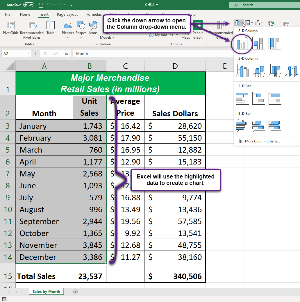
Figure 3.12 shows the column chart that is created once a selection is made from the column chart drop-down menu. Notice that there are two new tabs added to the Ribbon. These tabs contain features for enhancing the appearance and construction of Excel charts. These commands will be covered in more detail in a later chapter. For now, you will see that Excel places the chart over the data in the worksheet. The following steps explain how to move and resize the chart:
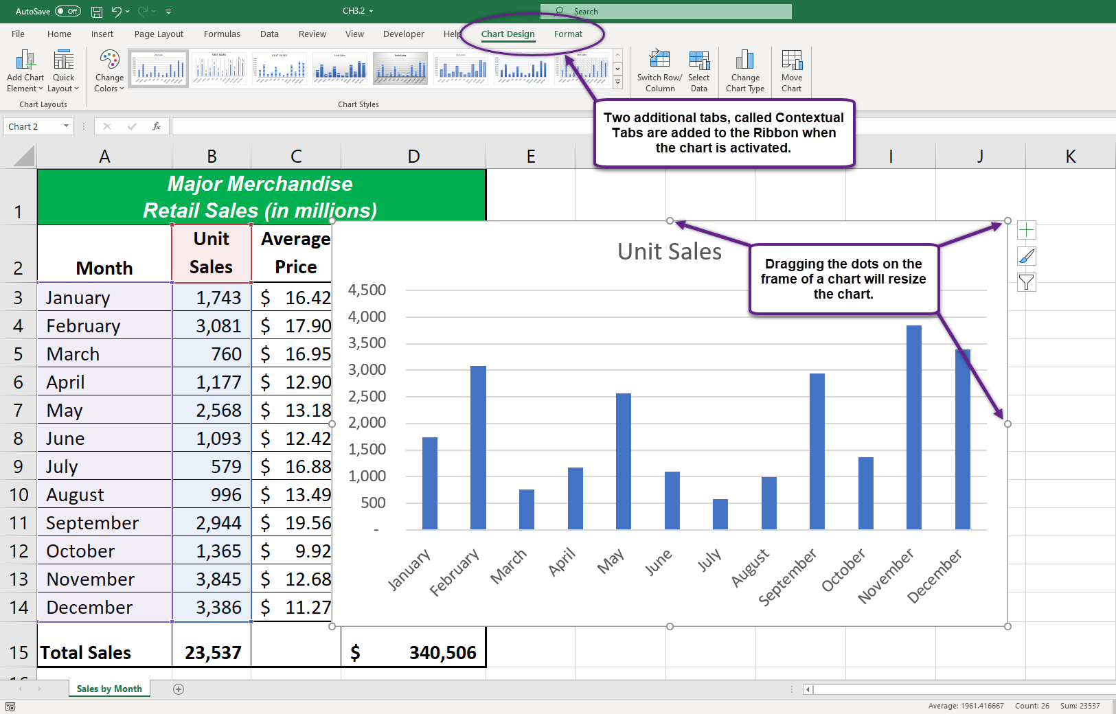
- While the chart is selected (buttons are visible around the outside of the chart), left click anywhere it the chart and drag the chart so the upper left corner is placed in the middle of cell F1
- Place the mouse pointer over the top center sizing handle (see Figure 3.12). You will see the mouse pointer change from a white block plus sign to a vertical double arrow. Make sure the mouse pointer is not in the cross-arrow mode as this will move the chart instead of resizing it.
- While holding down the ALT key on your keyboard, left click and drag the mouse pointer slightly up. The chart will automatically adjust up to the top of Row 1.
- Place the mouse pointer over the left center sizing handle.
- While holding down the ALT key on your keyboard, left click and drag the mouse slightly toward the left. The chart will automatically adjust to the left side of Column F.
- Place the mouse pointer over the lower center sizing handle.
- While holding down the ALT key on your keyboard, left click and drag the mouse slightly down. The chart will automatically adjust to the bottom of Row 14.
- Place the mouse pointer over the right center sizing handle.
- While holding down the ALT key on your keyboard, left click and drag the mouse slightly to the right. The chart will automatically adjust to the right side of Column M.
Why?
There Are No Sizing Handles on a Chart
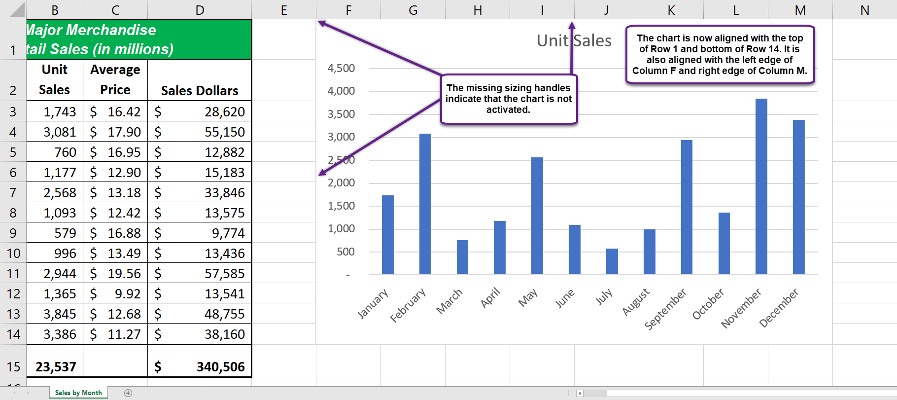
If you do not see the dots or sizing handles around the perimeter of a chart, it could be that the chart is not activated. To activate a chart, left click anywhere on the chart.
Figure 3.13 shows the column chart moved and resized. Notice that the sizing handles are not visible around the perimeter of the chart. This is because the chart is not activated. Once you click anywhere on the worksheet outside the chart area, the chart is automatically deactivated.
Why?
Use the ALT Key When Resizing a Chart
Using the ALT key while resizing an embedded chart locks the perimeter of the chart to the columns and rows of the worksheet. This gives you the ability to adjust the chart to precise sizes as you adjust the width and height of the worksheet rows and columns.
Using Contextual Tab Menus to Format a Column Chart
As shown in Figure 3.12, when a chart is created, two tabs are added to the Ribbon. The following steps explain how to use a few of the formatting and design features in these tabs:
- Check to make sure the column chart in Sheet1 is activated. To activate the chart, left click anywhere on the chart.
- Click the Design tab under the Chart Tools set of tabs on the Ribbon.
- Click the down arrow on the right side of the Chart Styles section (see Figure 3.14).
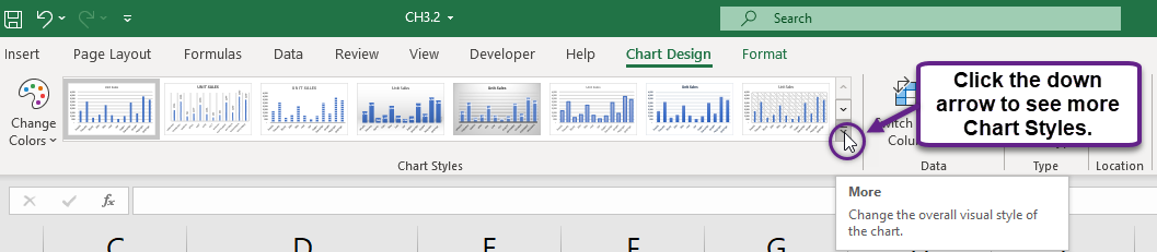
- Click Style 9 in the Chart Styles section. This style has a black background with blue columns (see Figure 3.14).
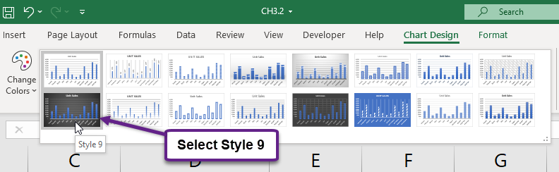
- Click Style 9. Notice that the format of the chart title as well as the X and Y axis titles changes.
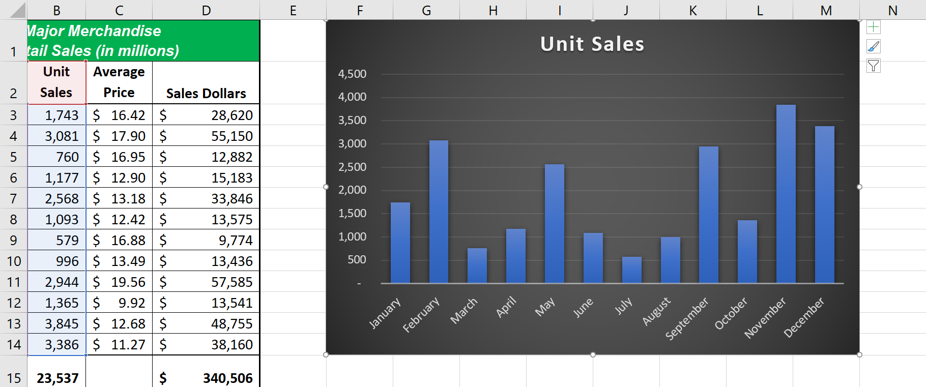
Figure 3.16 shows the embedded column chart with the formatting features applied. This chart is very effective in displaying the Unit Sales trends for this company. You can see very quickly that the tallest bar in the chart is the month of December, followed by the months of June, July, January, and February.
Skill Refresher
Creating a Column Chart:
- Highlight a range of cells that contain data that will be used to create the chart.
- Click the Insert tab of the Ribbon.
- Click the Column button in the Charts group.
- Select an option from the Column drop-down menu
Creating a Pie Chart
File: Continue using CH3.2
To assist the reader in analyzing data from the first 6 months, a pie chart will be created to graphically display the data. It is important for you to plan which type of chart will best display the data so your readers can quickly see key trends. More details on creating charts and on chart types will be presented in a later chapter.
The following steps are an introduction to creating the pie chart required for this chapter’s objective:
- Highlight the range A2:B8.
- Click the Insert tab of the Ribbon.
- Click the Pie Chart button: This will open the Pie and Doughnut chart drop-down menu of options (see Figure 3.17).
- Select the 2D Pie option from the list of column chart options (see Figure 3.17).
This will create an embedded chart in the Sheet1 worksheet (see Figure 3.18). Embedded means that the chart is on the worksheet that contains the original chart data. The chart is floating on the top of the worksheet and can be moved and sized on the face of the worksheet.
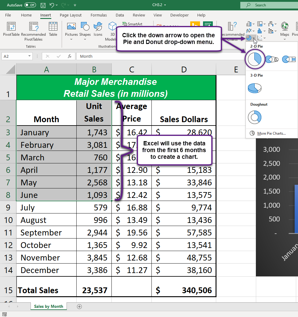
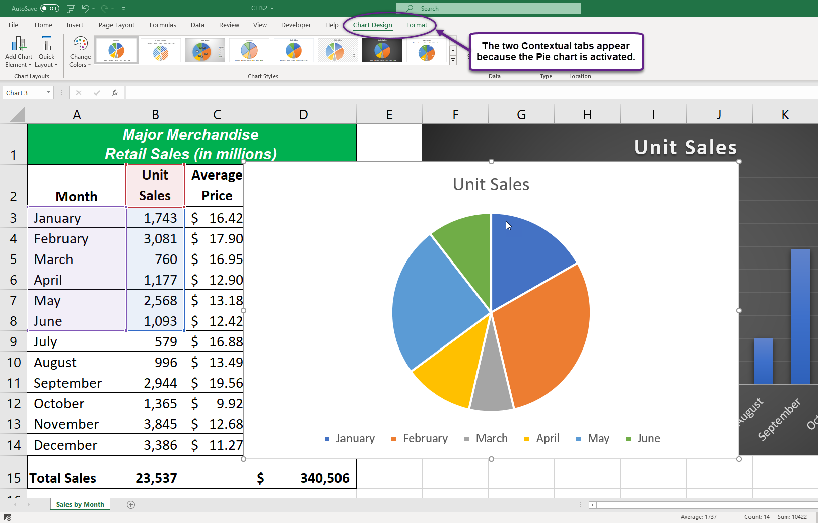
Figure 3.18 shows the Pie chart that is created once a selection is made from the drop-down menu. Notice that Excel places the newly created chart on top of the previously created column chart.
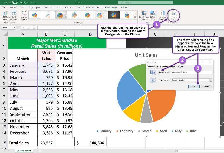
The first chart we created was embedded in an existing worksheet. Charts can also be placed in a dedicated worksheet called a chart sheet (see Figure 3.20). It is called a chart sheet because it can only contain an Excel chart. Chart sheets are useful if you need to create several charts using the data in a single worksheet. If you embed several charts in one worksheet, it can be cumbersome to navigate and browse through the charts. It is easier to browse through charts when they are moved to a chart sheet because a separate sheet tab is added to the workbook for each chart.
The following steps explain how to move the Pie chart to a dedicated chart sheet:
- While the chart is selected (buttons are visible around the outside of the chart), click the Move Chart button on the Chart Design contextual tab on the Ribbon (see Figure 3.19).
- In the Move Chart dialog box, click the radial button to move the chart to a new sheet.
- Rename the sheet to Jan-June Unit Sales and click OK.
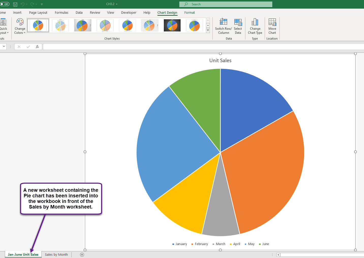
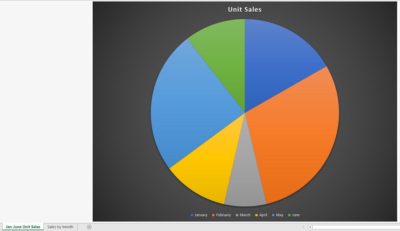
A new worksheet tab has been created in the workbook and appeared in front of the Sales by Month worksheet (see Figure 3.20).
Using Contextual Tab Menus to Format a Pie Chart
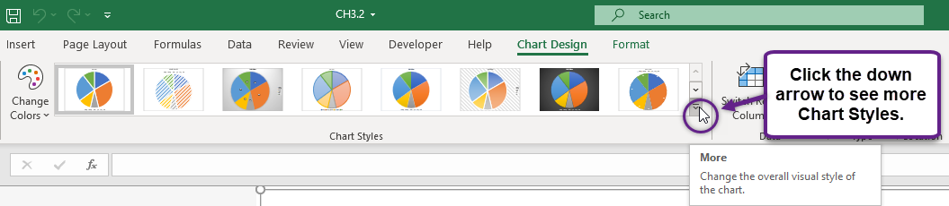
- With the Jan-June Unit Sales chart sheet activated, click the Design tab under the Chart Tools set of tabs on the Ribbon.
- Click the down arrow on the right side of the Chart Styles section (see Figure 3.21).
- Click Style 9 in the Chart Styles section. This style has a black background with blue columns (see Figure 3.22).
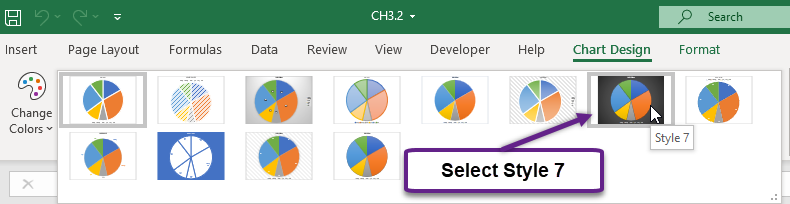
- Click Style 7. Notice that the format of the chart title as well as the X and Y axis titles changes.
Figure 3.23 shows the Pie chart formatted in a Chart Sheet. This chart is very effective in displaying the Unit Sales trends for this company in over a 6-month period but would not be a good choice for a 12-month period. You can see very quickly that the largest pieces of pie are January and February.
Skill Refresher
Creating a Pie Chart:
- Highlight a range of cells that contain data that will be used to create the chart.
- Click the Insert tab of the Ribbon.
- Click the Pie & Doughnut button in the Charts group.
- Select an option from the Pie & Doughnut drop-down menu
